The Impact of Text Hierarchy on Usability and Efficiency
It sounds obvious that visual hierarchy improves readability and navigation—but through this project, I saw firsthand just how much it impacts efficiency. Even when two interfaces contained the same amount of text, users perceived the one with weaker visual hierarchy as having significantly more text, making it harder to read and navigate. This experience reinforced the power of typography and button hierarchy in creating a seamless and intuitive user experience.
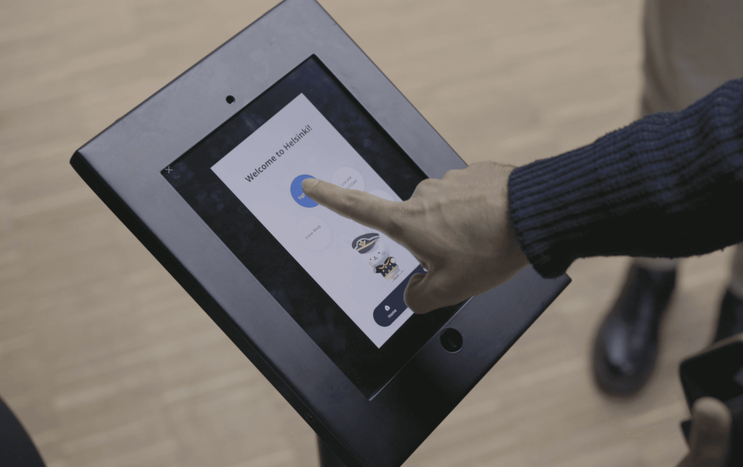
Project Overview: Digital-Physical Wayfinding for Ferry Stations
Navigating a ferry station should be simple—even for first-time visitors and non-local speakers. Our project aimed to create a digital-physical wayfinding system that ensures users can efficiently find their way, whether through a chat-based interface or a wizard-based UI.

Image: Wizard Interface(left), Chat Interface(right)
During user testing, we made an interesting discovery: although the chat-based UI and the wizard-based UI contained the same amount of text, users perceived the chat-based version as having significantly more text, making it harder to read and navigate.
The Importance of Text Hierarchy in UI Design
At first glance, the chat-based interface felt overwhelming due to its continuous blocks of text. However, upon closer analysis, we found that the total amount of text was no different from the wizard-based interface. The real issue wasn’t the quantity of text—it was the lack of visual hierarchy.
In contrast, the wizard-based UI used larger, bolded titles and structured text layouts, making it easier for users to skim and process information. Meanwhile, the chat-based UI lacked size variations in typography, causing users to struggle with reading and comprehension. Additionally, the chat-based UI kept previous choices visible before they scrolled out of view, creating an illusion of excessive text.
A/B Testing: Proving the Impact of Hierarchy
To validate our findings, we conducted A/B testing to compare how users interacted with different text hierarchies. We tested variations in font size, spacing, and button placement, confirming that a clearer visual hierarchy significantly improved readability and navigation efficiency.

Image: wick hierarchy(left), strong hierarchy(right)
Additionally, we observed that button hierarchy played a crucial role in user flow. Initially, users found the interface confusing because all buttons looked similar. Our original design aimed to give users more freedom in selecting their preferred options. However, we discovered that narrowing down choices and guiding users toward the best action improved usability. As designers, our role isn’t just to present options but to anticipate user needs and set a clear primary button that leads them forward seamlessly.
By restructuring the button hierarchy—prioritizing actions like "Done" > "Print My Ticket" > "Find My Gate"—we improved the overall usability of the design.
Key Takeaway: Visual Hierarchy Enhances Usability
This project highlighted the critical role of text and button hierarchy in UI design. Even with the same content, an interface can feel overwhelming if users cannot quickly distinguish key information. In future designs, we aim to implement structured typography and clearer button emphasis from the start, ensuring a more intuitive wayfinding experience.
