Redesigning Digital Engagement for the Finnish Red Cross
To address low engagement among young adults, we redesigned the Finnish Red Cross website and OMA app, improving visuals, usability, and membership visibility. Our UX/UI enhancements aimed to create a more intuitive experience, strengthening connections between young members and the organization.
Humanitarian Aid, NGO, Membership Organization
Research (30%+), UX/UI Design (80%+)—later independently refined UX and UI post-teamwork
UX/UI Design, Strategic Design, Service Design
Project Summary Overview
Problem
Outdated digital communication (Website, OMA) leads to misconceptions about membership, making it appear unengaging and lacking visibility.
Results
By prioritizing real Red Cross members, volunteers feedback and strategic service design, our project helped pave the way for a more engaging and effective digital experience for Red Cross members and volunteers.
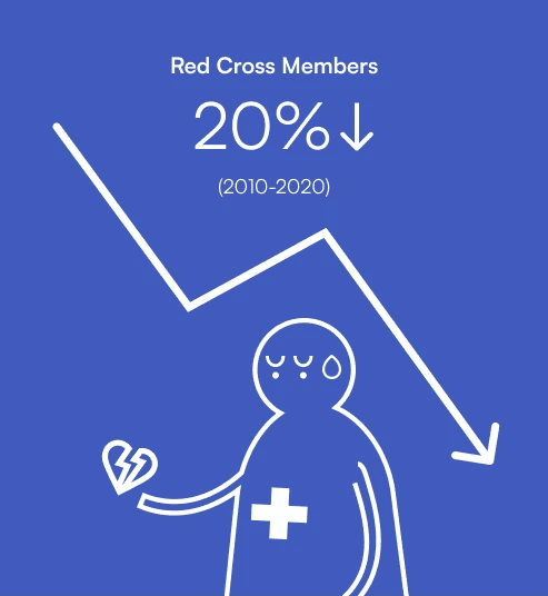
Red Cross Suomi faces challenges in attracting young generation members.
Research & Analysis
Interviews: Spoke with 3 members, 3 volunteers, 2 other NGO members, 3 board members, and 1 communication representative.
Observation: Attended a Red Cross district board meeting (Kallio-Käpylä department).
Workshop: Conducted an empathy workshop with the RC communication team.
Insights from Key Stakeholders
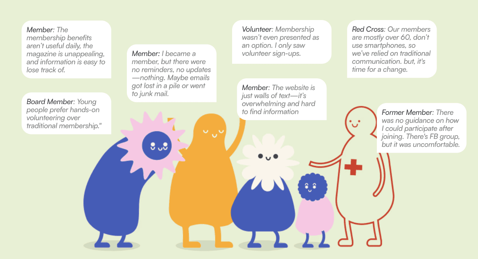
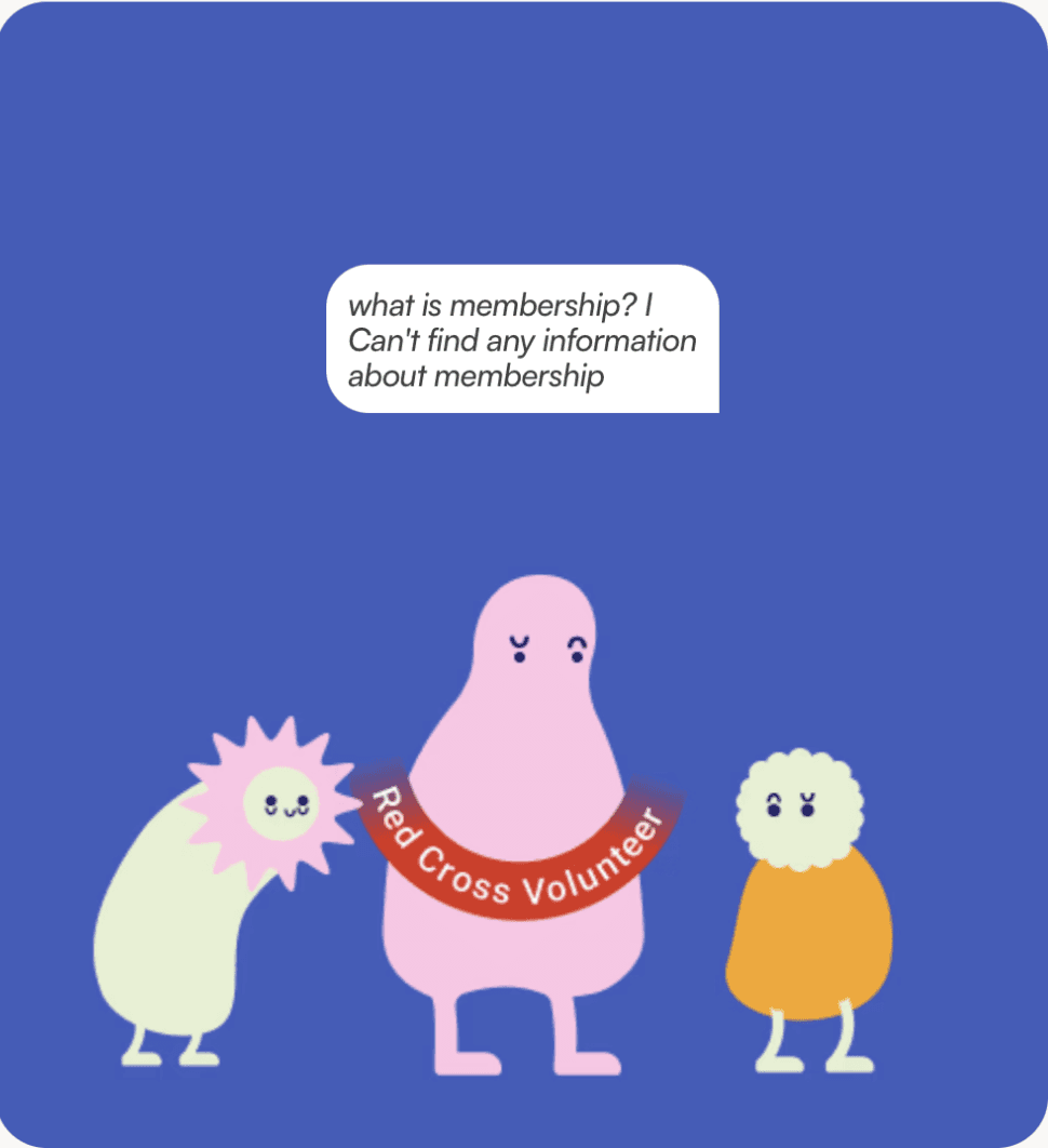
Young Volunteers: Misconceptions about membership—seen as expensive, for seniors/experts, and full of paperwork. None were aware of it.
Young Red Cross Members: Feel disconnected from benefits, struggle with outdated platforms, and lack clear event updates. Many would participate with better follow-ups.
Communication Team: Communication Team: Struggles to modernize digital communication and wants the website & OMA app to better engage youth.
Other Young NGO Members: Unclear on Red Cross activities, or membership, see little alignment with their interests.
Problem
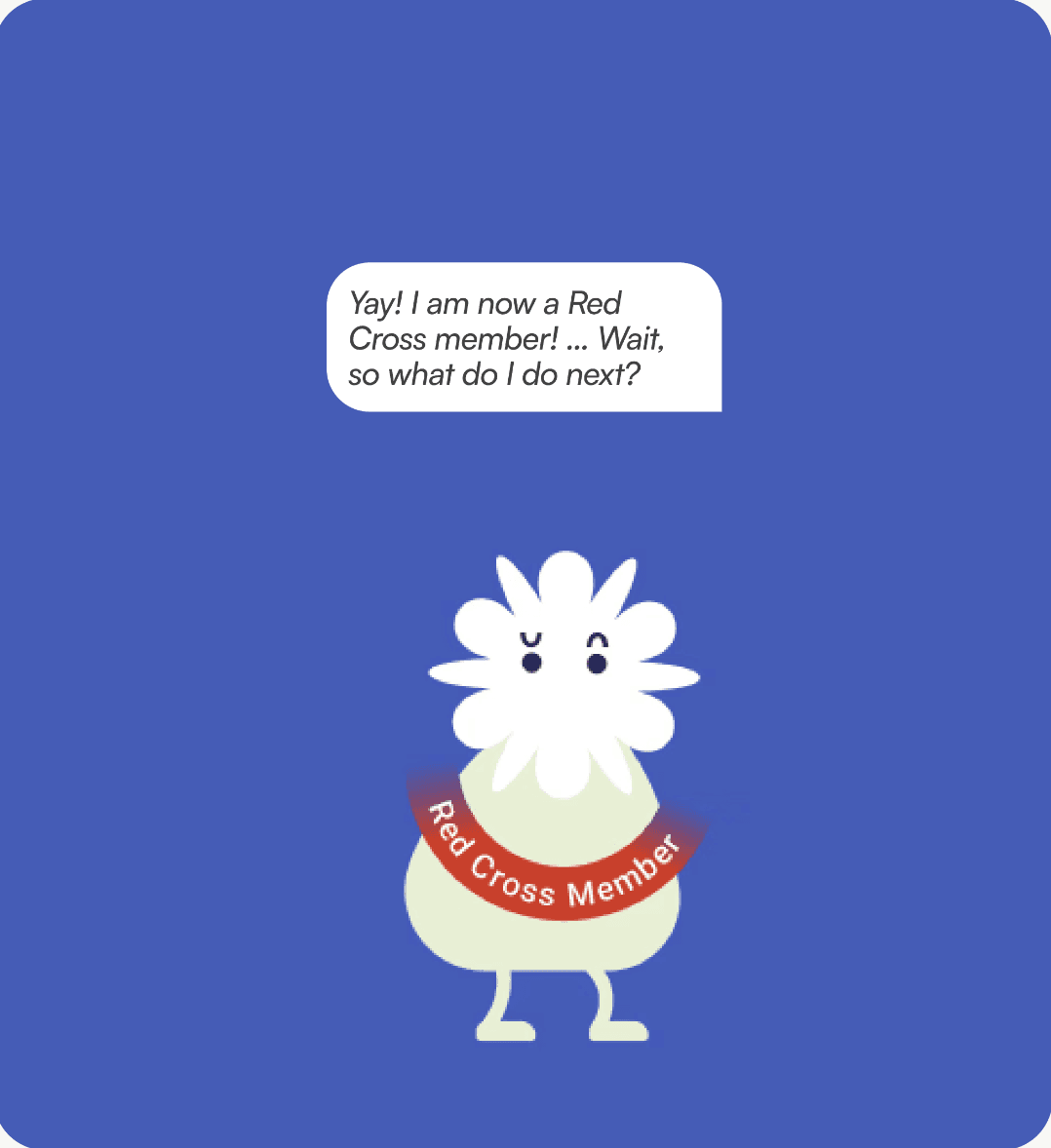
Low Membership Visibility, Poor Onboarding Leading to Lack of Engagement and Retention
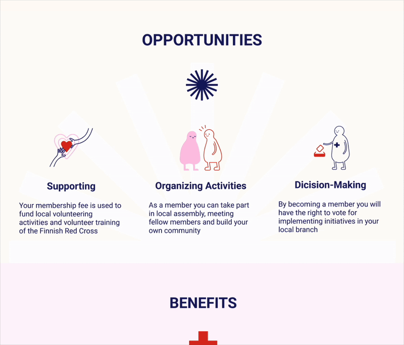
Opportunities
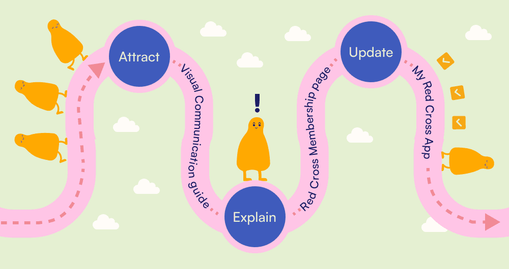
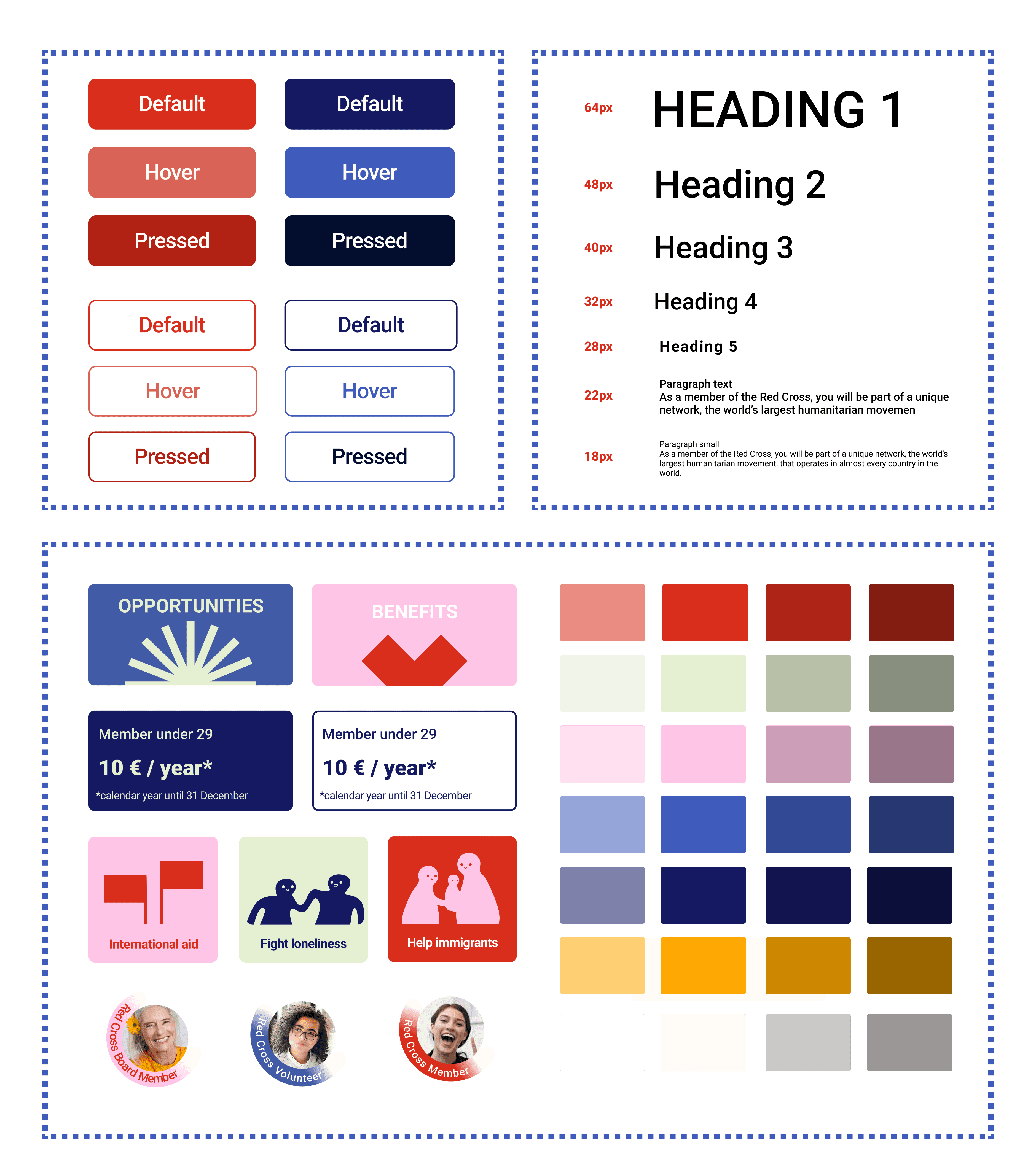
Prototype — Visual Communication Guide
Attract: Change the Tone of Voice to Sincere, Open, Enlightening, and Approachable.

After
✔️ Transformed distressing imagery into warm, engaging illustrations.
✔️ Implemented a card UI with graphic elements to organize text-heavy content.
✔️ Enhanced visual hierarchy for improved readability and effortless navigation.


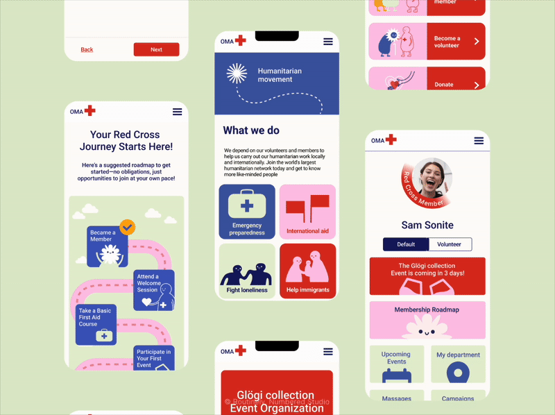
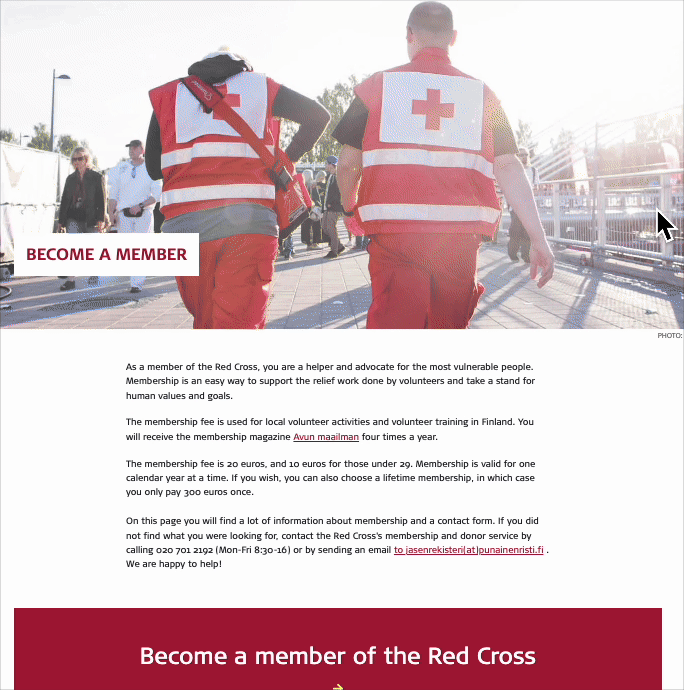
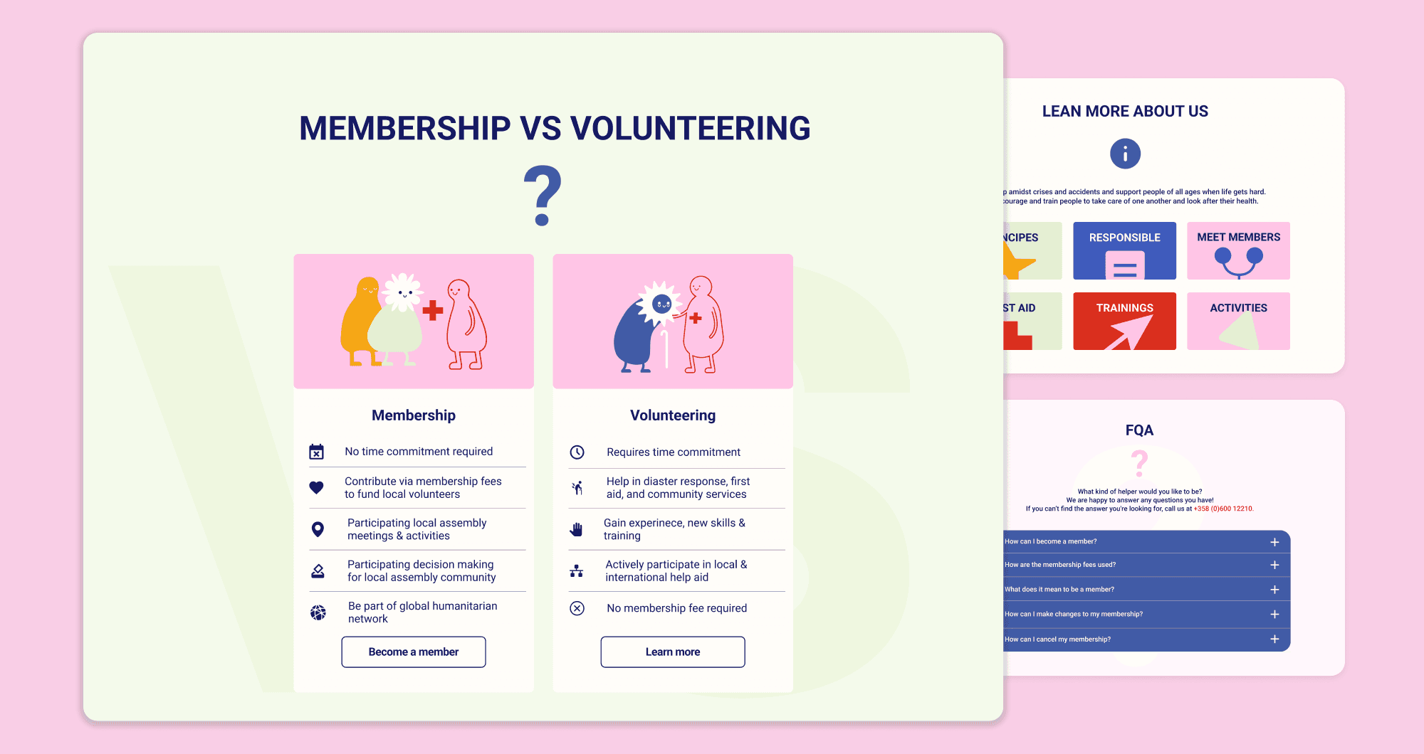
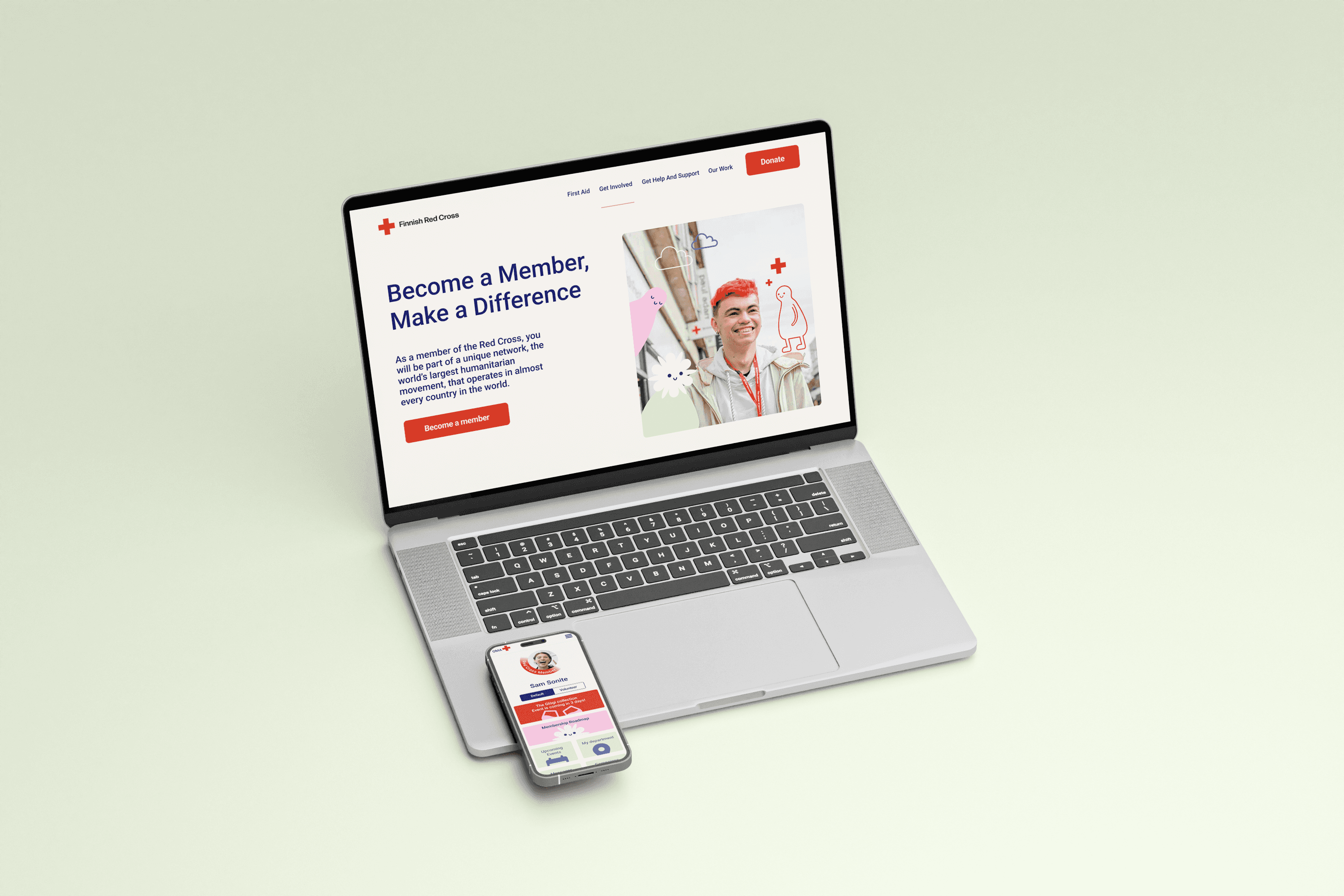
Prototype — Red Cross Website Membership Page
Explain: Enhance the visibility of the membership


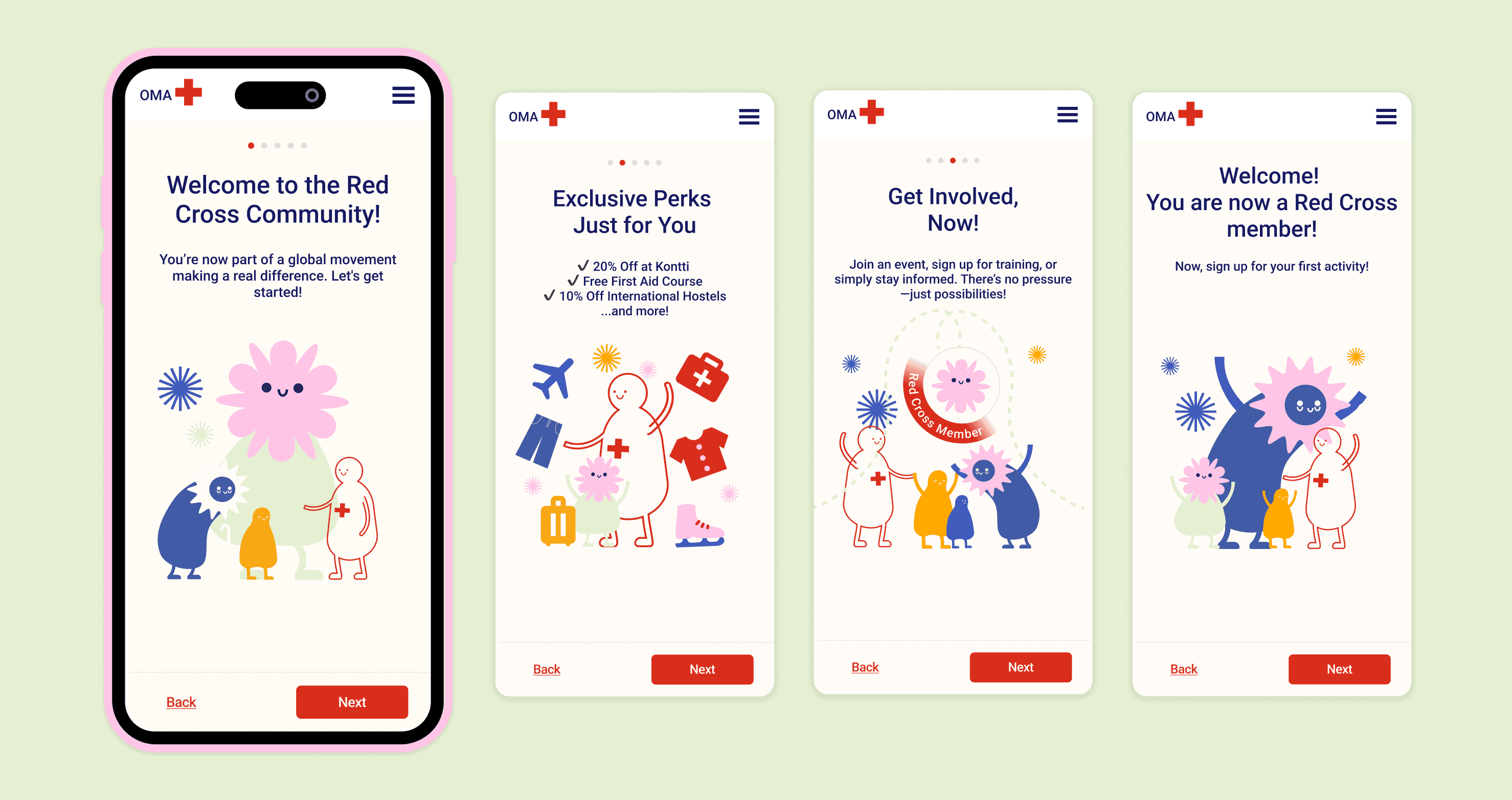
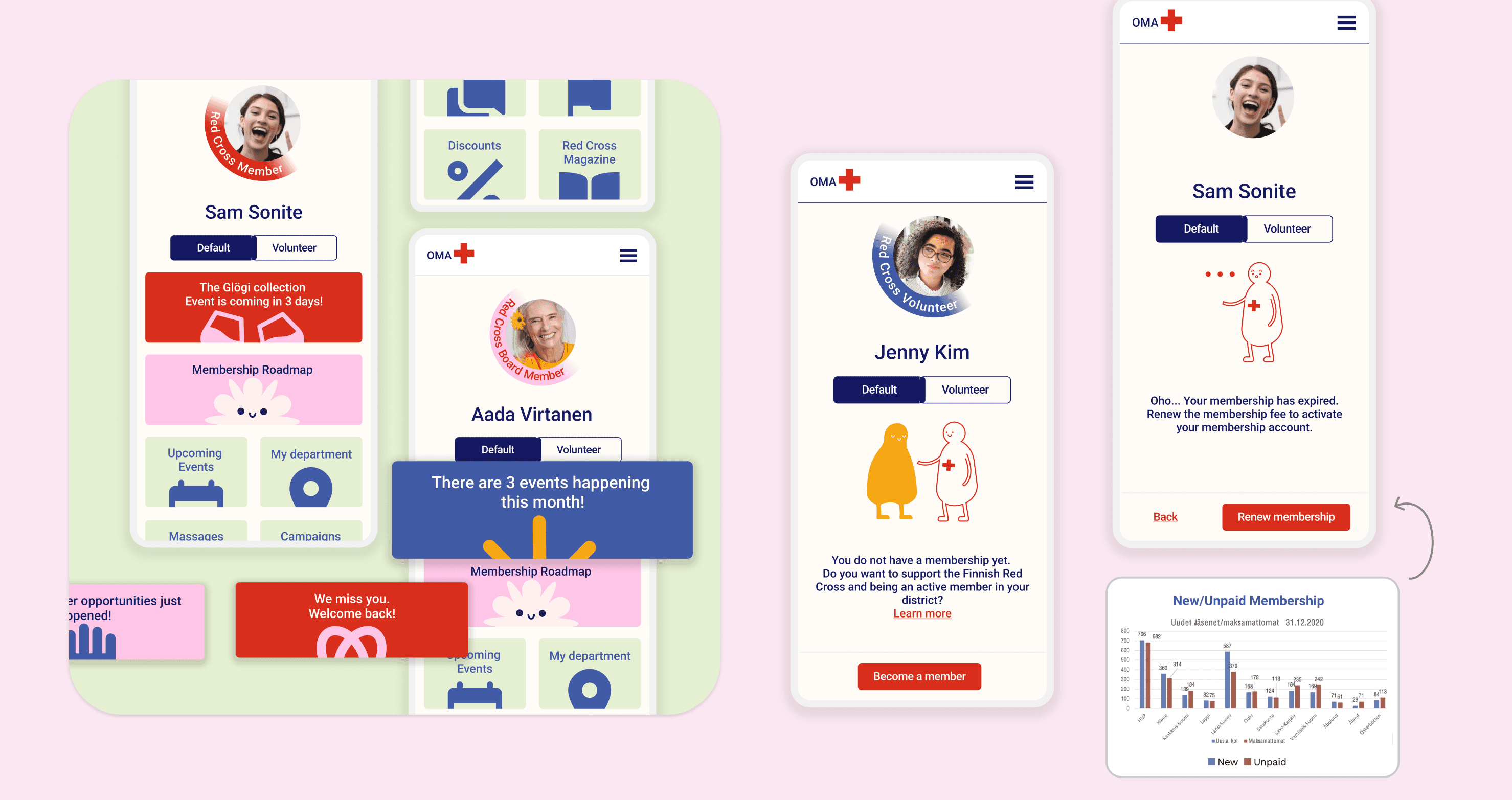
Update: Create a seamless onboarding experience & follow-up


Impact
Our project was highly recognized by the Finnish Red Cross for shaping their digital strategy and providing actionable insights for potential implementation.
Validated Insights: Our findings aligned with professional UX research, reinforcing existing challenges and confirming areas for improvement.
Enhanced User Engagement: Direct input from members and volunteers provided valuable user perspectives, shaping solutions that better address their needs.